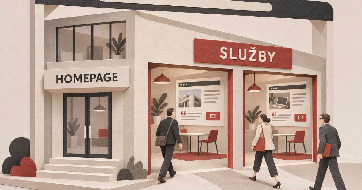
A customer may decide to contact you or buy before they ever visit your homepage. Give your service pages the attention they deserve.
Most businesses focus on getting their homepage right. That makes sense. It's often one of the most visited pages on a website, and customers use it to form their first impression.
But plenty of visits start elsewhere. Your campaigns often send customers to other pages, and search results take them straight to the service they're looking for. Will they find everything they need there and get a good first impression of your business, even if they never see your carefully designed homepage?
Ask yourself
Do your service pages include relevant testimonials or project examples, or do you keep those on the homepage? Do they explain how working with you works in practice? Is there a brief introduction to your company that helps build trust?
Customers might click through to other pages and find those details. You can't count on it, though.
The other pages people use to enter your website deserve attention too. Alongside the campaign traffic you deliberately send their way, they can bring customers directly from search.
An analysis by Jenny Lee Lynch published on November 4, 2026 compared organic clicks to 110 homepages across six industries in the third quarter of 2026 with the same period in 2025. 81 homepages, roughly 74% of the sample, saw a decline. The median year-over-year change was −21%.
The author recommends assessing traffic and inquiries across the whole website. Customers may find the page they need directly. That's the situation we'll focus on here.
Campaign pages get the attention service pages need
When we build a dedicated landing page for a campaign, we think carefully about the visitor's journey. We know what the ad promised and make sure the page follows through. We explain the offer, choose relevant testimonials or project examples, and show what happens after someone submits the form.
A regular service page needs the same care. Someone arriving from search also needs to establish whether you can solve their problem and whether they can trust you. We can't assume they've explored the rest of the website.
The same applies to visitors arriving through AI assistants. A Figment analysis updated on October 22, 2026 tracked 4,418 such visits across 21 UK business websites between June 26 and September 24, 2026. 42% started on a service or product page, compared with 34% on the homepage.
The page categories were based on approximate URL classifications, and the sample was small. Still, it illustrates a specific situation: customers arrive directly at an offer and start forming an opinion of the business from there.
AI assistants can direct people to the page that best answers their question. A service page may be the start of the entire customer journey. Your website design needs to account for that.
Customers need answers they can find
Should you add your company history, every testimonial, and a full list of services to every page? That would quickly fill each page with information unrelated to the visitor's problem.
Start with what they need to know at that moment. Can they tell from the opening whether the service is right for them? Do they understand what you can help them with? Can they find a similar project and see how the work would proceed?
Use those questions to decide what belongs on the page and in what order. Put the essential explanation directly on the page. Link to a detailed case study alongside the relevant project example. Offer technical documentation to visitors who need to check the requirements.
That lets interested customers explore the details without making everyone else read through them.
Baymard Institute research updated on October 13, 2026 shows how often businesses get content organization wrong. It includes more than 17,000 homepage and category evaluations across more than 180 leading US and European online stores. For homepage and category navigation, 61% of desktop sites and 65% of mobile sites received average-to-poor ratings.
The research focuses on online stores, where customers are choosing products. Difficulty finding information can also get in the way when they're choosing a business service.
Different customers ask different questions
A business owner and the person responsible for day-to-day operations may be choosing the same service. But they need different details. The owner considers the investment and future growth; the employee wants to know how they'll use the service and what will change in their work.
Visitors also arrive with different levels of knowledge. Some are just beginning to explore their options. Others are comparing offers and looking for a specific answer.
Your website structure should reflect those differences. You can organize content by audience, the problems you solve, or how people use the service. Visitors should be able to recognize which section applies to them and find the information they need.
We addressed these differences when designing the Chargee website. The company provides EV charging solutions for households, businesses, fleet managers, property developers, and local authorities. They all have an interest in electric mobility, but for different reasons.
The first section of the main menu therefore directs visitors by audience. Each group has its own page with relevant content. Households look for simplicity and reliability, while fleet managers need detailed, practical information about how the products and systems work.
Those needs shaped both the arguments we used and the level of detail.
Some information appears on several pages, with an explanation tailored to each audience. That repetition serves a purpose: visitors can find what they need in one place, whether or not they've seen the homepage.
They don't have to work through the entire offering to figure out what's relevant. They can go straight to content that matches their situation. Our Chargee case study explains the approach in more detail.
Organizing a website by audience won't suit every business. For Chargee, it reflected how different customers choose the service. Those needs should guide the design.
Try your website without the homepage
Open one of your service pages directly and read it as someone who has never heard of your business. Can they understand the offer? Do they know why they should contact you? Can they easily find more information if they're not ready to get in touch?
Then compare your answers with how people actually use the website. Look at which pages they arrive on, where they go next, and which pages generate relevant inquiries. That will help you identify where an explanation is missing, where a testimonial would help, and where customers struggle to find your contact details.
Can customers find what they need on your website without visiting the homepage? Let's talk. At Digital Vision, we'll review your website structure with you and plan it around how people choose your services.